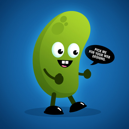
3D Chocolate. 30 min project
Today is a day of confession. I am an chocolate addict. I eat 2 bars a day on a regular basis. Probably can do more.Most definitely. Just never ‘ve been brave enough buy more… Once I was in Paris and stuck in amazement at a door of a little belgium choco store(somewhere in Saint-Germain, somewhere at a corner of Rue Cuvier & Rue Jussieu. It was just like a golden bonbon dream… But well my digital chocolate lesson not actually about chocolate itself, but rather I invented how to create metallic foil effect in Photoshop. At least, I have never saw this effect made by somebody else… So, here you are… eat my choco!
|
 |
 |
1. First of all, for the taste of chocolate, I created just one piece with help of same old Layer Styles. And when I was satisfied with it I just multiplied to get 4 by 7 bar.
|
 |
 |
2. And now main purpose of this project – realistic metal foil. For years I was so foolish to despise Gradient Modes other, than regular Linear and maybe Radial… How unforgivingly stupid I was!!! I got to repeat…. STUPID!
Anyway, I made square selection and started to fill it with… Diamond gradient in a Difference mode. After 6-8 chaotic draggs I applied Filter -> Stylize – Emboss with following parameters: Angle=130°, Height=2px, Amount=250% to have some crumpled paper effect.
|
 |
 |
| 3. In following steps I saved "crumpled paper" sample as Custom Brush shape. Named it "Foil". I changed my Custom Brush setting the way to make it as crazy as possible: highest Size and Angle Jitters, large amount of Scattering parameters. |
 |
| 4. Then I started to draw with Paint Brush in… of course, Difference mode. You can play it as long, as you want – it is addiction, it is just like caleidoscope… Wow! For the great fun, change your "Foil" Brush Size and Opacity. On a top of my "Foil" Layer I made colored Layer, with applied Cloud Filter to it, where Fore/Background colors are blue/gold. I setting Blend Mode of this Layer to Overlay to see underlying "Foil" Layer. |
 |
 |
5. In the final steps added paper wrapper to my choco bar. I transformed my objects to make them look dimensional, added some texts, drop shadows, glows, etc.
Bon Appetitte!
 |
Selasa, 15 November 2011
3D Chocolate
Kamis, 10 November 2011
Create Simple Cartoon Characters in Photoshop
The use of colourful vector art is a great way to create an accessible and friendly webpage. When done well it is possible to create a rich and vibrant art style which will capture the imagination. We walk you through the basics to get you going on Photoshop CS and newer.
Here’s the end result of this tutorial.
Sabtu, 05 November 2011
Exposure blending tutorial
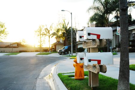
After posting Getting the Exposure Right, I received a quite a few questions about how I achieved the HDR (High Dynamic Range) version of the mailbox photo (last photo in that article). This tutorial will walk you through the basics of creating the same look by hand. All you need is camera and photo editing software that supports layer masking (you can follow these steps in Photoshop, Paint Shop Pro, and The GIMP, among others).
A little background: HDR is a type of image manipulation. The goal is to blend multiple exposures of the same scene into a single image in order to get a result that has more dynamic range than your camera is capable of recording. Typically this applies when you have uneven lighting in your scene as in the example photo.
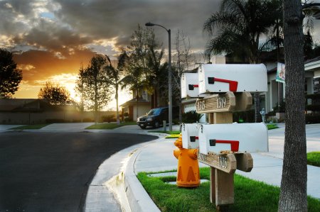
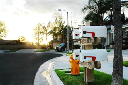
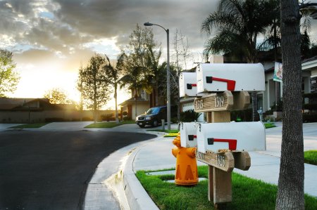
Final HDR result—this is what we’re going for.
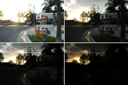
Exposures chosen for HDR blending.
 Then
I add masks to my top three layers so that they are hidden (the
contents of the masks are black). This effectively removes the top
three exposures from the image and lets the fourth, bottommost image
show through. Now grab a largish brush with a soft edge and paint white
onto the black areas of the masks where you want the associated image
to show through.
Then
I add masks to my top three layers so that they are hidden (the
contents of the masks are black). This effectively removes the top
three exposures from the image and lets the fourth, bottommost image
show through. Now grab a largish brush with a soft edge and paint white
onto the black areas of the masks where you want the associated image
to show through.Imagine you are looking down on a set of transparencies stacked one on top of the other. Where the mask is black, the layer beneath shows through. Where the mask is white, the image in that layer is what you will see. Gray portions of the mask blend the layers smoothly.
This step can be quite time consuming and you’ll find yourself going back and forth painting different portions of the masks on different layers to bring out more or less detail in your final photo. Start with a large, soft brush to quickly get to a rough draft. Later, switch to smaller brushes to make refinements.
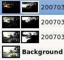
The masks for this project ended up being quite complex. Here are the individually masked layers:
Layer 2 mask (one from bottom)
Layer 3 mask
Layer 4 mask (top)
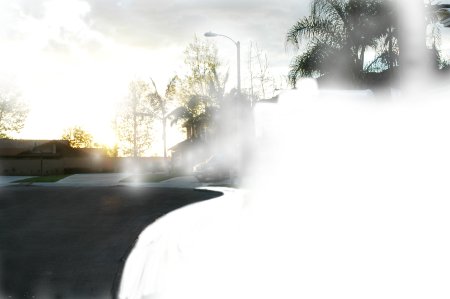
Layer 1 (bottom) by itself
Layer 2 is added on top of that. Notice this layer was used to bring in detail in the clouds and to darken the street for additional contrast.
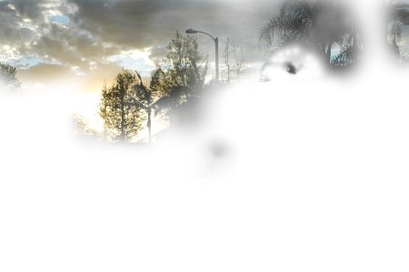
Layer 3 added. More cloud and tree detail.
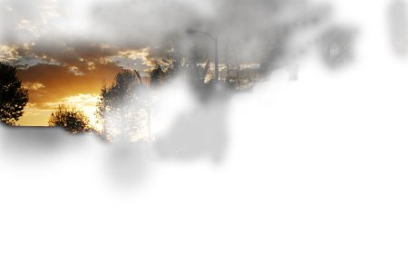
Layer 4 added. Sunset detail. Final result.
thx to : John Watson ( http://photodoto.com/ )
Selasa, 01 November 2011
Light Effect On A Model
| Light Effect On A Model |
 Light is a cool subject to talk about. After reading some articles
about light effect, I decided to write a tutorial showing how to create
a very spectacular light effect around a model. Before that, I will
show you a quick technique to retouch portrait and bring new look on
it, step by step
Light is a cool subject to talk about. After reading some articles
about light effect, I decided to write a tutorial showing how to create
a very spectacular light effect around a model. Before that, I will
show you a quick technique to retouch portrait and bring new look on
it, step by step
|
Step 1: Open a new document, I used 800x600 pixels and look for a model photo on the internet, this is the one I used:

Step 2: As you can see, it is a bit dark so we should make it brighter first. Duplicate your photo by pressing Ctrl-J and change its blending mode to Screen. Simple, right?


thx to : http://www.9tuts.com/
Langganan:
Postingan (Atom)