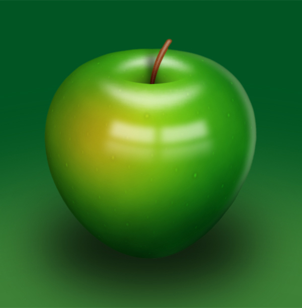
In this tutorial, I’ll be showing you how to draw a shiny green apple. We’ll have a look at various painting techniques throughout this tutorial. It will be fun and you’ll learn something new – let’s started!
Editor’s note: In an effort to introduce some of our older content to some of our newer readers we have resurrected this post from October 2008 for everyone to enjoy for the first or second time. Enjoy!
Step 1
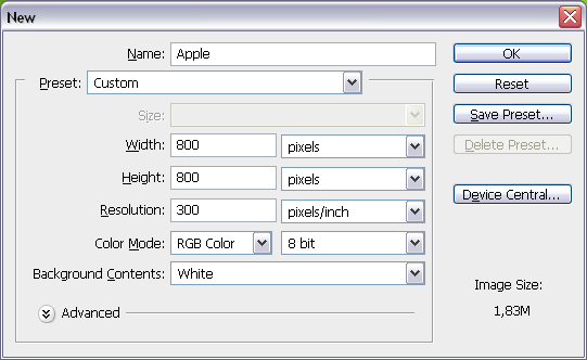
Create a new document using the settings shown below.
Step 2
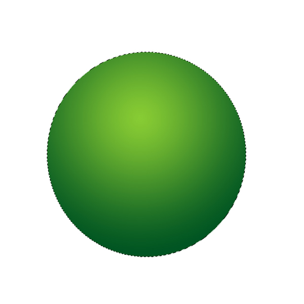
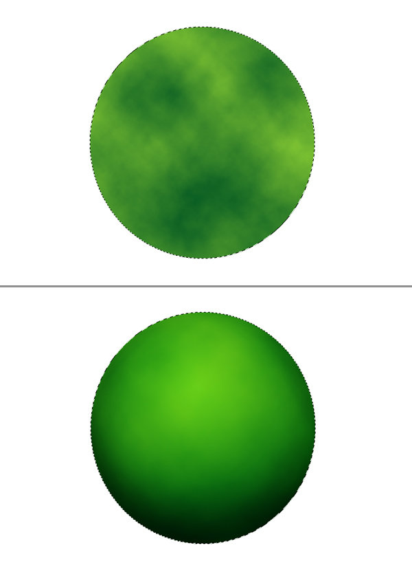
Create a new layer and name it "Apple." Grab the Elliptical Marquee Tool, make a selection as in the below image. Next, grab the Gradient Tool, then pick Foreground to Background and set Style to Radial. Make your Foreground Color #88cc33 and Background Color #005522. Fill the selection as shown.
Step 3
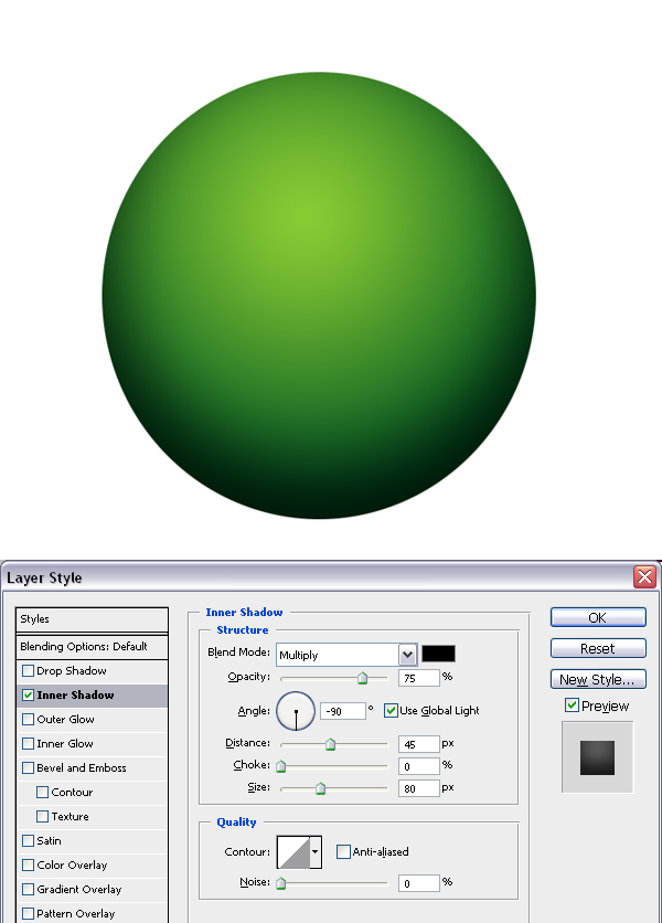
Apply the Inner Shadow layer style using these settings: Blend Mode set to Multiply, Opacity at 75%, Angle set to -90 degrees, Distance set to 45 pixels, and Size set to 80 pixels.
Step 4
Create a new layer and name it "Texture." Command-click the "Apple" layer to load the selection, if the selection is not still active. Use the colors from step one and go to Filter > Render > Clouds. Next go to Filter > Distort > Spherize, and set the Amount to 100% and Mode to Normal. This will give our simple texture a spheric look. Set the layer Blending Mode to Soft Light. Now we have some texture on the apple.
Step 5
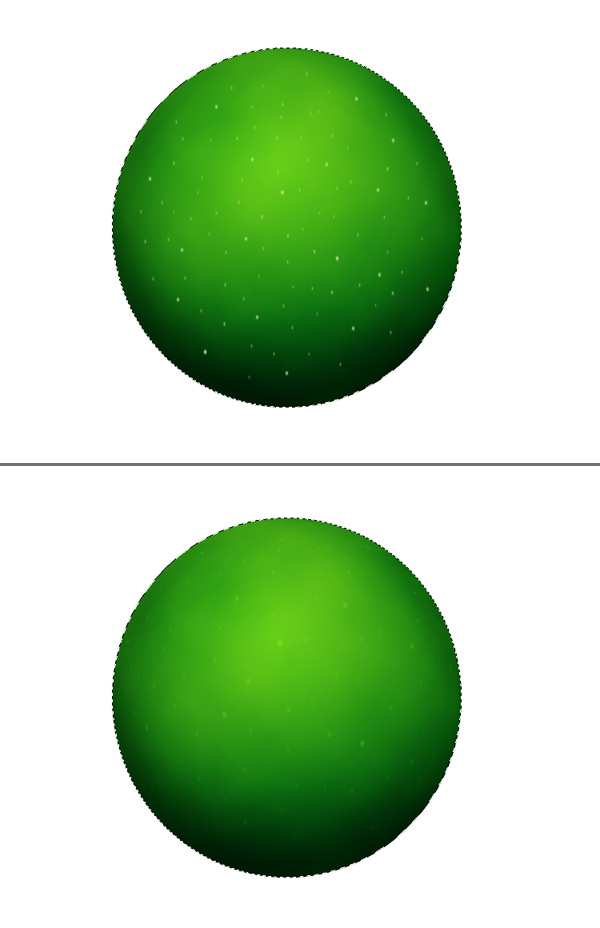
Create a new layer on top and name it "Dots." Get the Brush Tool and set the Foreground Color to #ccdd99. Also, set the Master Diameter to 5 and Hardness to 100, then create several dots by placing single clicks all around the apple.
Set the Master Diameter to 3 pixels and paint some more. Command-click the "Apple" layer to load the selection, if the selection is not still active. Go to Filter > Blur > Motion Blur, and set the Angle to 90 degrees and Distance to 3 pixels. Now go to Filter > Distort > Spherize, set the Amount to 100, set the Mode to Normal, and apply it. Set the layer Blending Mode to Overlay and Opacity at 50%. Hit Command + D to deselect.
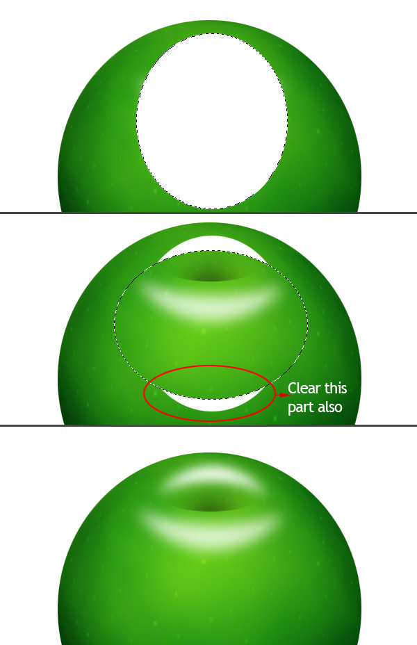
Step 6
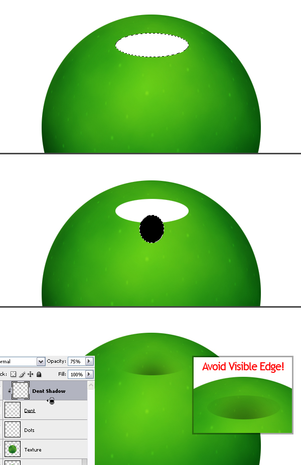
Create a new layer on top and name it "Dent." Grab the Elliptical Marquee Tool and make a selection, as shown in the below image, then fill it with white and Deselect. Create another layer and name this one "Dent Shadow." Make an elliptical selection, as in the image below, and fill it with black.
Alt-click on the line between the "Dent Shadow" and "Dent" layers in the Layers Palette. Deselect by hitting Command + D. This will define the "Dent" layer as a Clipping Mask for the "Dent Shadow" layer. Now go to the "Dent" layer in the Layers Palette and set the Blending Mode to Multiply.
Go back to the "Dent Shadow" layer and apply a Gaussian Blur filter with a radius of 17 pixels. Set the Layer Opacity at 75%. The size of the dent ellipse may vary in your document, so you can adjust the Radius of Gaussian Blur filter to avoid the visible top edge of the ellipse.
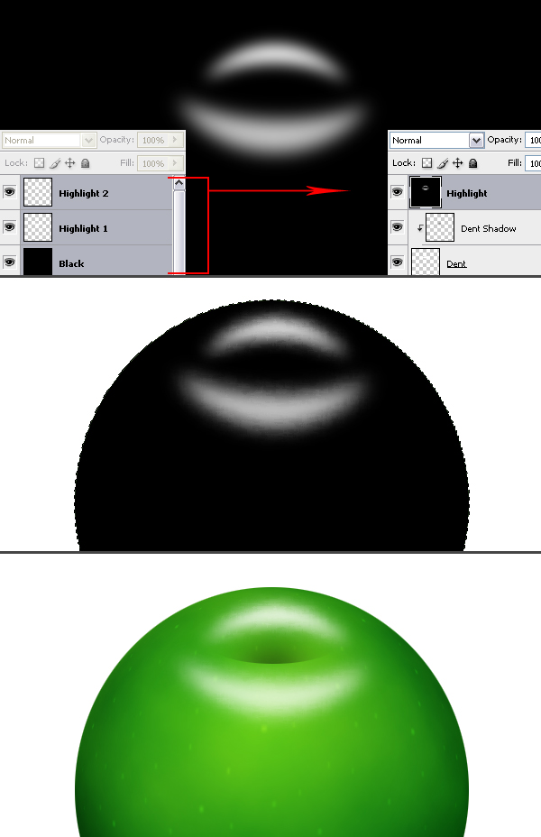
Step 7
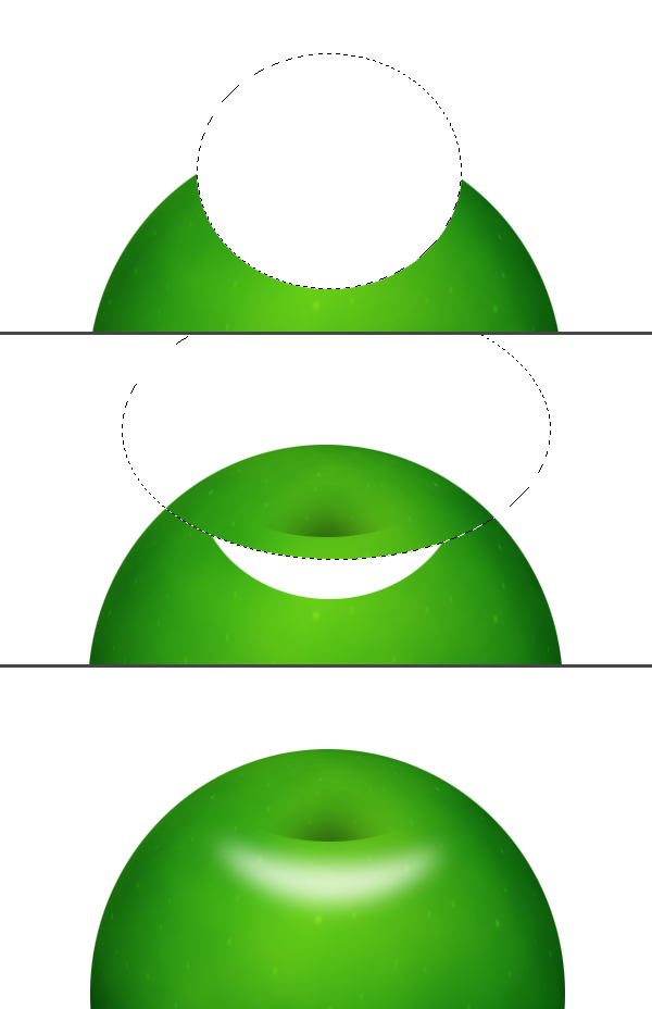
Now we’ll make some highlights. Create a new layer on top of the layer stack and name it "Highlight 1." Grab the Elliptical Marquee Tool and make a selection, as in the below image, and fill it with white. Now make a bigger elliptical selection as shown, then hit Delete to clear the selection. Deselect and go to Filter > Blur > Gaussian Blur, and apply with a Radius of 10 pixels.
Step 8
Create a new layer on top of the layer stack and name it "Highlight 2." Grab the Elliptical Marquee Tool and make a selection as shown, then fill it with white. Now make another elliptical selection as shown, then hit Delete to clear the selection. Also, don’t forget the select and clear the white piece below. Deselect and go to Filter > Blur > Gaussian Blur, then apply with a Radius of 8 pixels.
Step 9
Now create a new layer below "Highlight 1" layer and name it "Black." As you can tell from the name, we are going to fill it with black. Now select "Black," "Highlight 1," and "Highlight 2" layers in the Layers Palette and merge them by hitting Command + E. Go to Filter > Brush Strokes > Spatter. Set Spray Radius to 6 and Smoothness to 14. Command-click the "Apple" layer to load the selection, go to Select > Inverse and hit Delete to clear. Set layer Blending Mode to Screen. Deselect.
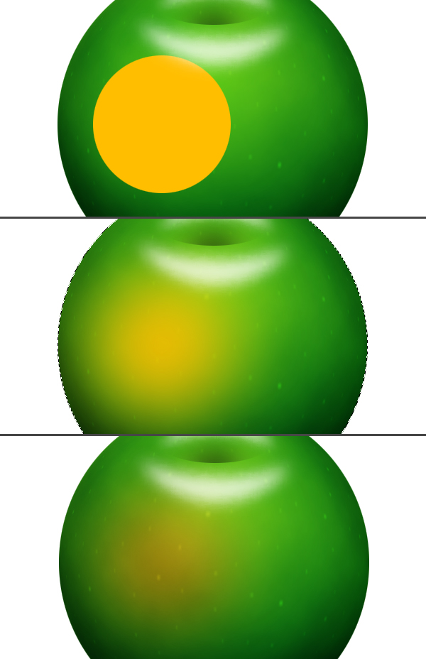
Step 10
Create a new layer above the "Dots" layer, and name it "Red." Grab the Elliptical Marquee Tool and make a selection as shown, then fill it with the color #ffbe00. Command-click the "Apple" layer to load the selection. Go to Filter > Blur > Gaussian Blur and apply with a Radius of 50 pixels. Next, set the layer Blending Mode to Hue. Now, deselect by hitting Command + D.
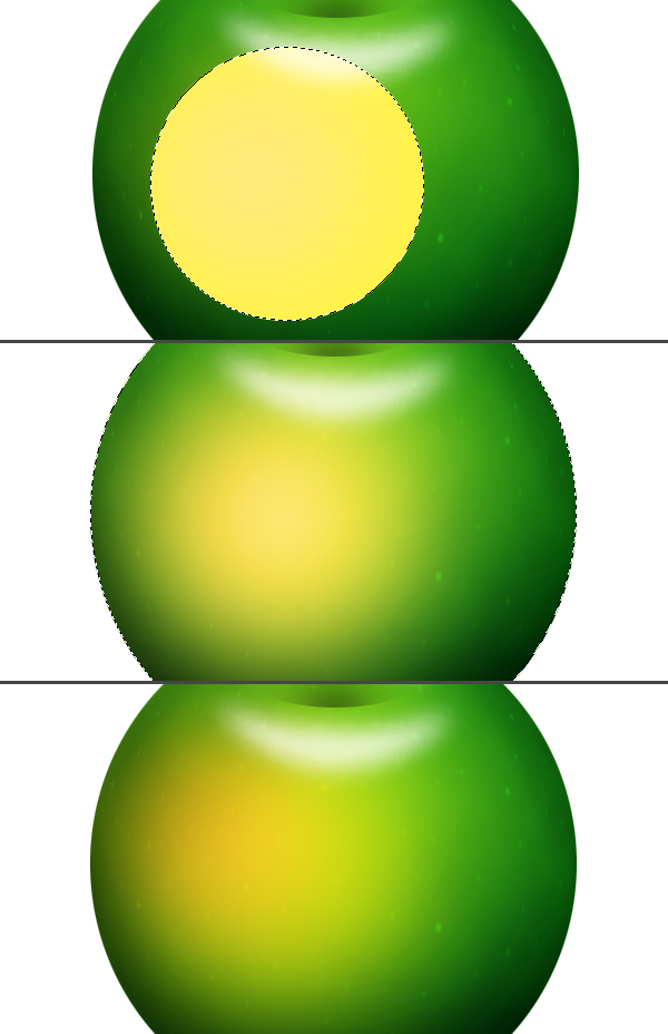
Step 11
Create a new layer below the "Red" layer, name it "Yellow." Grab the Elliptical Marquee Tool and make a selection as shown, then fill it with the color #fff444. Command-click the "Apple" layer to load the selection. Go to Filter > Blur > Gaussian Blur and apply with a Radius of 50 pixels. Next, set the layer Blending Mode to Hard Light and Opacity at 75%. Deselect by hitting Command + D.
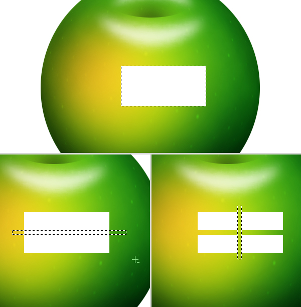
Step 12
Create a new layer on top and name it "Reflection." Grab the Rectangular Marquee Tool and make a selection as shown, then fill it with white. We’ll make a window reflection out of this rectangle. So select two rectangular areas as shown, then clear them.
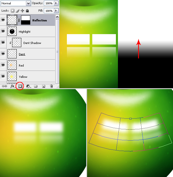
Step 13
Go to the Layers Palette and add a Layer Mask to the "Reflection" layer by clicking the Add Layer Mask button. Grab the Gradient Tool, set it to Linear Gradient. Fill the layer Mask with the gradient, as you can see in the below image.
The Layer Mask is selected at the moment, click the "Reflection" layer thumbnail to go back to the layer. Now, go to Filter > Blur > Gaussian Blur and apply with a Radius of 8 pixels. Go to Edit > Transform > Warp, and select Arc from the presets list, then set the Bend to -20%.
Step 14
Create a new layer on top and name it "Backlight." Command-click the "Apple" layer thumbnail and fill the selection with white. Make sure the Marquee Tool is selected, then move the selection about 10 pixels left using the Left Arrow key. Now, hit Delete to clear.
Command-click the "Apple" layer again to load the selection, then go to Filter > Blur > Gaussian Blur, and apply with a Radius of 7 pixels. Hit Command + D to deselect. Grab the Eraser Tool, then set the Master Diameter to 270 pixels and Hardness at 0%. Erase the lower part of the backlight, as you can see in the below image.

Step 15
Create a new layer and name it "Stalk." Grab the Pen Tool, set to Paths in the tools options. Draw a curve for the stalk of the apple. Now, grab the Brush Tool and open the Brushes Palette. Under Shape Dynamics, set the Dynamic Control for Size to Fade. Set the Steps for Size Fade to 70 and set Minimum Brush Diameter to 20%. Under Brush Tip Shape, set the Diameter to 14 pixels and Hardness to 100%. Now, set the Foreground Color to #884411.
Go to Paths Palette, open the Paths Palette pop-up menu (click the triangle in the upper right to open) and choose Stroke Path, set the Tool to Brush and hit OK. Click somewhere outside the path in the Paths Palette. Command-click the "Dent" layer thumbnail in the Layers Palette to load its selection.
Grab the Rectangular Marquee Tool, then while holding the Shift key, make a selection that covers the upper part of the stalk. Go to Select > Inverse, then hit Delete to clear the lower exceeding part of the stalk, and deselect.
The path you have drawn is stored in the Paths Palette as a "Work Path." It stays there until you draw another path, then the new path you draw will be your "Work Path." If you want to keep the existing path before you draw a new one, you can give it a name by double-clicking on the path. Thus you won’t loose it when you draw a new one. If you want the path to disappear in your document, then go to Paths Palette and click somewhere outside the path in the Paths Palette.

Step 16
Create a new layer and name it "Stalk Highlight." Grab the Brush Tool and set the Master Diameter to 5 pixels. Set the Foreground Color to white. Now go to the Paths Palette, make sure Work Path is selected, open the Paths Palette pop-up menu, then choose Stroke Path, set Tool to Brush, and hit OK.
Command-click the "Stalk" layer thumbnail in the Layers Palette to load its selection. Go to Filter > Blur > Gaussian Blur and apply with a Radius of 1 pixel. Set the layer Opacity at 40%. Select the "Stalk" layer in the Layers Palette, then go to Filter > Noise > Add Noise. Set the Amount at 3%, set Distribution to Uniform, make sure Monochromatic is checked. Now, deselect by hitting Command + D.
Grab the Burn Tool, and using a soft brush (I set Master Diameter to 65 pixels and Hardness to 0%), make the bottom part of the stalk darker.

Step 17
Create a new layer below the "Stalk" layer and name it "Stalk Shadow." Grab the Rectangular Marquee Tool and make a selection, as in the image below. Fill it with black and Deselect. Go to Edit > Transform > Perspective and tweak the perspective of the layer as shown.
Go to Filter > Blur > Gaussian Blur, set the Radius to 7 pixels, and apply. Grab the Eraser Tool, and using a soft brush, clear the top part of the shadow. Next, Command-click the "Dent" layer to load the selection. Grab the Rectangular Marquee Tool, then while holding the Shift key, make a selection that will cover the top part of the shadow. Now go to Select > Inverse and hit Delete to clear. Deselect and set the Layer Opacity to 60%.

Step 18
Now we can make the finishing touches before we merge the layers. First, I’ll fill the background with the color #004400. Next, I made some minor changes. I set the Opacity of the "Highlight" layer at 85%, "Yellow" at 35%, "Red" at 85%, "Dent Shadow" at 95%, "Backlight" at 60%, "Reflection" at 55%.
I applied an Inner Glow Layer Style to the "Apple" layer to make the edges a little bit darker using these settings: Blend Mode of Multiply, Opacity set at 30%, Size set to 20 pixels, and Color set to #003300. I also changed the "Apple" layer Inner Shadow Opacity to 45%.
Finally, I applied an Outer Glow layer style to the "Dots" layer with these settings: Blend Mode set to Multiply, Opacity at 60%, Color set to #2b2b2b, and Size set to 8 pixels. Now select all the layers except the "Background" layer in the Layers Palette, then go to Layer > New > Group From Layers, and name the group "Apple."

Step 19
Create a new layer below the "Apple" group and name it "Shadow." Grab the Elliptical Marquee Tool and make a selection as shown, then fill it with black. Deselect and go to Filter > Blur > Gaussian Blur, and apply with a Radius of 40 pixels.

Step 20
Create a new layer above the "Background" layer and name it "Light." Grab the Elliptical Marquee Tool and make a selection as shown, then fill it with the color #338833. Deselect, then go to Filter > Blur > Gaussian Blur, and apply with a Radius of 75 pixels.

Step 21
Now we have our apple ready but it looks too much like a sphere, but you can give it an apple shape using the Warp transform. Right-click the "Apple" group and merge it. Go to Edit > Transform > Warp and distort it to give it an apple shape.

Conclusion
You’ll see some distortion on the edges which are caused by the Warp transform. To get rid of them Command-click the "Apple" layer, go to Select > Modify > Feather, and set the Radius to 1 pixel. Next, go to Select > Inverse and hit Delete three or four times to clear the distorted area from the edges. And you finished!
Thanks to Eren Goksel