Google Translator

Tampilkan postingan dengan label PS - Beginner Level. Tampilkan semua postingan

Jumat, 20 April 2012

Berbagai Koleksi Logo Hitam Putih

Hi, RL Design Fans..
Pie kabare?? Apik apik wae kan?

Setelah agak beberapa hari vakum ni, akhirnya saya bisa buat postingan baru juga nih..
Yah, akhir2 ni lagi sibuk-sibuknya dengan berita Nazaruddin yang akan dijatuhi hukuman.. Tapi ga terlalu urus lah, biarlah yang berwenang mengurusnya.. Nah, kita cuma mengurus bagaiamana menambah wawasan design kita..

Nah, kali ini saya ingin berbagi dengan RL Design Fans semua tentang koleksi logo design berbasis warna hitam putih..
Ya, lumayan lah untuk menambah perbendaharaan  RL Design Fans  semua..

Langsung cekidot aja nih...

Kamis, 08 Maret 2012

Mengenal Brosur

Kali ini kita akan membahas tentang Brosur..

Teman2 rioDesign pasti ga asing lagi dengan namanya brosur kan? ya, kadang kita sebut ini flyer, selebaran, atau sebagainya. Tapi apa pun itu, sebagai designer kita perlu tau bagaimana mendesign brosur yang baik.. Bagaimana kita mencari minat para konsumen / masyarakat dari brosur yang kita design tersebut, karena brosur dibuat dengan tujuan untuk memasarkan suatu brand, produk, atau event tertentu. So, otomatis kita harus bisa mencari peminat/pembaca supaya tertarik dari produk yang ditawarkan..

Berikut adalah defenisi brosur :

-Menurut definisi UNESCO, brosur adalah terbitan tidak berkala yang tidak dijilid keras, lengkap (dalam satu kali terbitan), memiliki paling sedikit 5 halaman tetapi tidak lebih dari 48 halaman, di luar perhitungan sampul.
- Menurut brosurkilat.com, 
Brosur adalah alat promosi yang terbuat dari kertas yang di dalamnya terdapat sejumlah informasi dan penawaran mengenai jasa atau produk.

- Menurut Rio Andrew, Brosur adalah media komunikasi visual yang dipakai untuk memperkenalkan atau mempromosikan suatu brand, produk, image, event dan lain sebagainya yang menjadi perwakilan suatu perusahaan atau organisasi tertentu.


Tujuan dari brosur :
  • Banyak sekali kegunaan dari brosur selain untuk media promosi
  • Mengenalkan produk perusahaan Anda.
  • Memberitahukan potongan harga atau promo yang sedang di jalankan oleh perusahaan Anda.
  • Memberitahukan katalog dari produk perusahaan Anda.
  • dll 

Berikut saya tampilkan beberapa inspirasi brosur atau sejenisnya yang telah dibuat oleh beberapa designers lokal.

Brosur 2 - http://riodesign-web.blogspot.com


Yap, demikian pembahasan kita kali ini.. Sampai jumpa di postingan berikutnya ya rioDesign Fans.

Best Regards,
rioDesign [ Belajar Design dari Newbie to Master]

Referensi :
- id.wikipedia.org
- brosurkilat.com


Teman-teman boleh meng-copy artikel saya ini untuk keperluan teman2 (tugas sekolah, atau dijadiian postingan di blog teman2), tapi harus ada tertera link kami www.7designers.blogspot.com sebagai referensi ya.. Trims :)

Anda juga mungkin ingin membaca ini :
- Membuat Kumis dan Jenggot asli dari Photoshop

Silakan beri komentar anda disini.... Atau tulis pertanyaan anda sekitar blog kami di Contact Me atau FAQ.

Minggu, 04 Maret 2012

Membuat Bayangan Di atas air by Rio Andrew

Preview Final Result

Artis Name            :  Rio Andrew M Purba
Software Design    :  Photoshop CS 2 ke atas.
Durasi Design        :  30 s/d 45 menit
Model Design        :  Teguh ( Teman Kampus ku, klo ada yang mau kenalan, boleh kok. Hahahaha )
Design Assets        :  -  Foto teman saya/Model Design (download)
                               - Gambar Kolam (download)


Hi RL Design Fans..

Mau dikit sharing ni sebelum saya bagiin trik design kita kali ini.

Semalam tuh sungguh hari yang melelahkan, karena saya musing-musing keliling Medan untuk nyari dimana SMAN12 Medan. Loh Mau apa? Iya, anak SMAN 12 Medan akan mengadakan PENSI dalam waktu dekat, jadi mereka pesan design Logo, brosur, badge name, and design baju.


Untuk design logo, brosur, badge name nya udah saya kasi dari jauh jauh hari. Kalau Baju nya baru tadi saya kasi. Nah muter-muter nyariin akhirnya ketemu juga. Tapi rasa lelah terbayar sudah, karena dana langsung cair.. J :D Siapa yang mau saya traktir? Silakan daftar di kotak Komentar di bawah Posting ini. Hahaha. Pulang dari situ, saya langsung pergi menuju ke tempat makan bersama sekretaris saya (hehehe), ngenyangi perut dulu, soalnya udah sore.. Tapi tiba-tiba setelah siap ma’am, ujan deras turun, padahal jam udah nunjukin jam Setngah Tujuh. Wah, kepaksa nungguin ujan reda deh.. Belum lagi nganterin sekretaris pulang. Aduh, singkat cerita, sampe dirumah tu jam9.

Sampe rumah, saya makan lagi [hehehe] terus bersih-bersih, nonton bola dulu Arsenal Vs Liverpool. Haah, siap jam 10. Saya teringat akan RL Design. Wah harus publish 1 Tutorial ni. Karena saya ga boleh buat sedih para RL Design Fans . Mereka pasti udah nunggu-nunggu 1 Tutorial terbaru keluar. Tapi apa judul yang enak ya? Saya teringat kepada teman SMK saya . 2 Hari yang lalu dia SMS saya minta ajarin bagaimana membuat bayangan orang diatas kolam renang. Nah, langsung saya buat aja deh. Sekitar 1 jam setengah selesai deh ni tutorial. Tapi karena semalam dah ngantuk kali, jadi siang ini deh baru bisa saya upload, karena saya harus ibadah dulu paginya. Ok Langsung aja.

Check it Out ya !!


1. Langsung aja, Langkah pertama download dulu semua design assets yang ada diatas semua gratis ( bila ada proses penginputan Chapta atau Kode dalam proses mendownload, lakukan saja. Hal itu digunakan untuk sistem keamanan saja. Gapapa kok ]. Setelah itu, buka Gambar Kolam dan Gambar Teman Saya ke photoshop Sobat-RL-Design. Sobat-RL-Design boleh gunain foto sendiri juga.

2. Selanjutnya pada foto Teman saya, lakukan penyeleksian. Boleh dari Lasso Tool, boleh dari Pen Tool. Tapi buat Sobat-RL-Design yang masih new bie, pake aja Lasso Tool.


Kamis, 10 November 2011

Create Simple Cartoon Characters in Photoshop


The use of colourful vector art is a great way to create an accessible and friendly webpage. When done well it is possible to create a rich and vibrant art style which will capture the imagination. We walk you through the basics to get you going on Photoshop CS and newer.
Here’s the end result of this tutorial.
Simple Character

Sabtu, 05 November 2011

Exposure blending tutorial


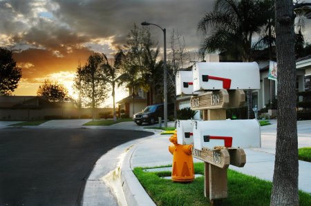
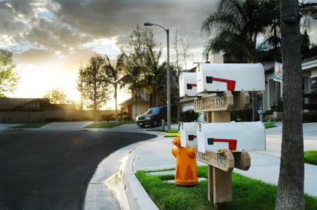
After posting Getting the Exposure Right, I received a quite a few questions about how I achieved the HDR (High Dynamic Range) version of the mailbox photo (last photo in that article). This tutorial will walk you through the basics of creating the same look by hand. All you need is camera and photo editing software that supports layer masking (you can follow these steps in Photoshop, Paint Shop Pro, and The GIMP, among others).

A little background: HDR is a type of image manipulation. The goal is to blend multiple exposures of the same scene into a single image in order to get a result that has more dynamic range than your camera is capable of recording. Typically this applies when you have uneven lighting in your scene as in the example photo.
HDR final output
Final HDR result—this is what we’re going for.
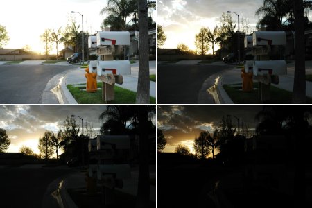
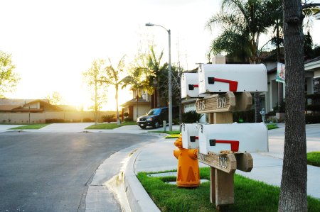
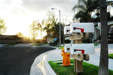
The first step in creating an HDR image is to shoot your scene multiple times at different exposure settings. A tripod comes in handy here. The idea is to get at least one frame with the correct exposure for each region of your scene. In this case, there are four regions I want to capture full detail in: the sunset, the clouds surrounding the sunset, the middle ground trees, and the mailboxes in the foreground. I started shooting with the exposure set for the mailboxes and then gradually decreased the exposure in steps of about 2/3 of a stop, taking a shot at each step, until I got a good exposure for the sunset. I ended up with about 10 frames but decided just to use the following four in the final image:
Exposures chosen for HDR blending
Exposures chosen for HDR blending.
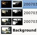
The next step is to load these images up in your image editor of choice. Create a new image and stack each of these exposures in separate layers. You can go from darkest to brightest or brightest to darkest—whichever way you choose, keep them in order. I chose to put the darkest layer on top and the brightest foreground layer at the bottom of the stack.
Layer stack with masksThen I add masks to my top three layers so that they are hidden (the contents of the masks are black). This effectively removes the top three exposures from the image and lets the fourth, bottommost image show through. Now grab a largish brush with a soft edge and paint white onto the black areas of the masks where you want the associated image to show through.
Imagine you are looking down on a set of transparencies stacked one on top of the other. Where the mask is black, the layer beneath shows through. Where the mask is white, the image in that layer is what you will see. Gray portions of the mask blend the layers smoothly.
This step can be quite time consuming and you’ll find yourself going back and forth painting different portions of the masks on different layers to bring out more or less detail in your final photo. Start with a large, soft brush to quickly get to a rough draft. Later, switch to smaller brushes to make refinements.
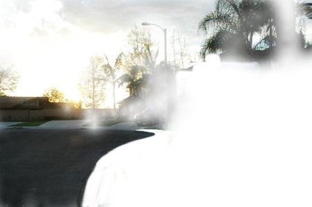
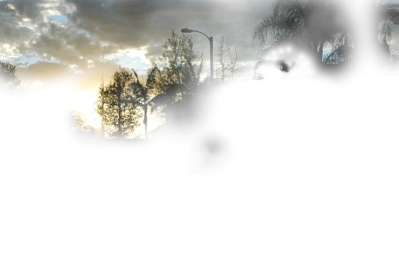
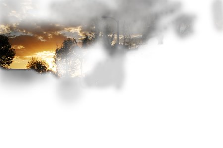
The masks for this project ended up being quite complex. Here are the individually masked layers:
Layer 2 mask (one from bottom)
Layer 2 mask (one from bottom) Layer 3 mask
Layer 3 mask
Layer 4 mask (top)
Layer 4 mask (top)
The following images demonstrate how these masks combine together to achieve the final result:
Layer 1 (bottom)
Layer 1 (bottom) by itself Layer 2
Layer 2 is added on top of that. Notice this layer was used to bring in detail in the clouds and to darken the street for additional contrast.
Layer 3
Layer 3 added. More cloud and tree detail.
HDR final output
Layer 4 added. Sunset detail. Final result.
This technique is time-consuming and difficult to master. A good way to ease yourself into this kind of manipulation is to try blending just two layers together with a single mask. That is much simpler than trying to juggle multiple masks. Two exposure masks are actually very useful in a number of situations. In fact, you don’t even need two separate exposures. This same technique is often used to simply blend an adjustment made to one layer with the layers beneath such that the adjustment doesn’t affect the entire layer. This technique can be used to adjust the contrast only in a portrait subject’s eyes, for example, or to apply localized sharpening or blurring.

thx to : John Watson ( http://photodoto.com/ )


Selasa, 01 November 2011

Light Effect On A Model


Light Effect On A Model

LightEffect125x125 Light is a cool subject to talk about. After reading some articles about light effect, I decided to write a tutorial showing how to create a very spectacular light effect around a model. Before that, I will show you a quick technique to retouch portrait and bring new look on it, step by step


Step 1: Open a new document, I used 800x600 pixels and look for a model photo on the internet, this is the one I used:
LightEffect1
After downloading, place it on your document. Now we will start to retouch it!
Step 2: As you can see, it is a bit dark so we should make it brighter first. Duplicate your photo by pressing Ctrl-J and change its blending mode to Screen. Simple, right?
LightEffect2
 It is now better. Merge down this layer donw by pressing Ctrl-E. After that, duplicate it again and go to Filter>Blur>Gaussian Blur and use a value of 4.5 pixels
LightEffect3
Step 3: Change the blending mode to Overlay and merge it down. The model now looks wonderful!
LightEffect4
 Step 4: Next we will add some light on her. Use the Pen tool and make some point around the dark areas of the model, don't need to be so exact
LightEffect5
 Step 5: Convert this path into a selected area, you can save this area for later use by going to Select>Save Selection
LightEffect6
Step 6: Create a new layer and go to Filter>Render>Clouds and Filter>Artistic>Plastic Wrap, just use the default values
LightEffect8
Now change its blending mode to Color Dodge. Your photo may look a bit different:
LightEffect9
Step 7: In the next steps, we will add light effect on the model. Use the Pen tool to draw some curves on her
LightEffect10
 LightEffect11
Step 8: Reset your colors by pressing D and invert them by pressing X. Choose the Brush tool and go to Window>Brushes to open the Brushes panel. Pick a small brush (about 5 pixels) with 0% hardness and tick on Shape Dynamics. Create a new layer, choose the Pen tool again, right click and choose Stroke Path. Make sure you tick on the Simulate Pressure before pressing OK
LightEffect13
A small curve, thinner at two ends appear like this:
LightEffect14
Step 9: Repeat step 8 again but this time we also tick on the Scattering checkbox (make sure you make it on a new layer)
LightEffect15
After choosing Stroke Path, we get
LightEffect16
Now we can delete the path by pressing Enter. Double click on your two new created layers to open Layer Style dialog box. Use Outer Glow as following:
LightEffect17
Use the Eraser tool to delete some light areas, the glowing light seems to surround her. After this step, we get:
LightEffect18
Step 10: Make our light effect stronger by duplicate the "glowing dots" layer. Press Ctrl-I to invert its colors
LightEffect19
Change the blending mode to Overlay. And this is the result:
LightEffect20
This technique can be used in various ways but the principle is still the same. Hope you enjoy this tutorial.

thx to : http://www.9tuts.com/


Sabtu, 24 September 2011

"Background Eraser Tool" is the new Magic Wand


We are going to use a very little known Photoshop tool call "Background Eraser Tool". It's a super useful tool for removing background colors while preserving the main picture that you want. It's pretty simple so you can start using it immediately after the tutorial.

1. Open up a image you want to remove the background from. Try to choose a picture with the background that contrast with the main picture.You can duplicate this layer if you want to preserve the original picture.

Image source: http://alexandramaria.deviantart.com/art/endless-summer-IV-96487618

2. Click the "Background Eraser Tool". Set a soft brush(Low hardness) with the size comfortable to remove the background. Set :"Sampling: Once". Leave the tolerance at 50%. Select "Protect Foreground Color".


3. Click the "Eyedropper Tool" to select the color of the picture you want to protect. For my picture, i would click the log.


4. Switch back to "Background Eraser Tool" .Click on the color of the background and start dragging around to erase the background.


5. If there is change in the color of the foreground, switch back to "Eyedropper" Tool and sample the color again. Repeat Step 4 again.


6. After you erase the entire background, let your imagination run wild!!


Here is another i tried using the same technique.
Original Pic:


Edited Pic:

 
thx to : http://mix-mash.blogspot.com/